In terms of branding yourself or shaping the identity of the business you are trying to put up, you should always start by defining your purpose. As soon as you have built your foundation, you should bring your brand forward and wow them with your visuals and graphic masterplans.
Knowing your brand first-hand makes a big difference. It is a competitive edge that not many people put so much effort into – knowing their brand identity who they cater to. As soon as you find out that out, everything else will fall into place.
Don’t worry if this is something you only just thought about. This list will help you improve or achieve your visual identity and get the best out of it.
What are the basics of building your visual identity? They are brand colors, font styles and imagery.
While each has its own impact, these three work together simultaneously to create a perfect recipe. But how should you maximize them?
Build familiarity and relationship
What makes visual communication wondrous is how it draws someone in. Your visual schemes produce some kind of seduction that over time increases your brand recognition.
You should also take note that all possibilities can come into play so don’t limit your creative plans to what you have already set. As they say, go beyond your gut. If people say that the color on your logo is off, don’t snob and walk away. You should consider what your audiences feel about your brand. And getting inputs directly from them will strengthen your customer-brand relationship because you listen to them.
Choose your colors wisely
When you see colors white, black, and gray, you might remember “the” Apple. Striking red hues might remind you of Coca-Cola, McDonald’s, Jollibee, or your favorite hotels, and restaurants.
Aside from their phenomenal products, these huge companies played on how they want to be seen and how to entice people through their colors.
To get your engines started, here are some key points from a survey about color perceptions.
Red (Put Graph)
- Passion (11%)
- Love (10%)
- Power (7%)
- Anger (5%)
- Blood (5%)
- Danger (5%)
It’s not a coincidence that the biggest of the biggest brands are colored red—just in different hues. This is because this color is as bold as Beyonce shouting, “Attention!” Red is associated with powerful feelings. May it be positive like passion or negative as anger. If you want your brand to communicate strong emotions, then red is your color.
Blue (Put Graph)
- Water/sea/ocean (13%)
- Calm (12%)
- Ocean (6%)
- Cool (6%)
- Sky (6%)
- Peace (5%)
- Sad/sadness (3%)
Blue communicates peace and calmness and sometimes gloom. This color is perfect for businesses such as resorts, spas, seafood restaurants, etc. If you want your brand to evoke a sense of home and composure, blue is definitely your color!
Green (Put Graph)
- Nature (17%)
- Grass (6%)
- Life (5%)
- Fresh (4%)
- Growth (3%)
- Health (2%)
Green is grounded in nature. It is often associated with growth, renewal, and healing. Green is the environmentalists’ color of choice. If your product is environmental friendly or about health, green is a good color to consider.
Yellow (Put Graph)
- Sun/sunshine (13%)
- Happy/happiness (9%)
- Bright/brightness (6%)
- Warm (3%)
- Earth/earthy (2%)
- Light (2%)
Yellow is often associated with happiness and brightness. Like the sun, the color brings joy to everyone. But unlike the other colors on the list, this color isn’t that easy to the eyes. Make sure to pick the right hue or match it with other colors that complement it.
Find the perfect font
Just looking at this may seem unproblematic. Choosing the right font does not require a lot of work, right? But if you want your brand to go a long way, your font should stand out.
There are hundreds if not thousands of fonts swarming on the internet now. Some are downloadable and some should be paid. The downloadable ones are often the kind that you would want to use, except that it doesn’t need investment, there are many free fonts online that are look aesthetically pleasing. But of course, if you want to give your brand a unique spin, buying might be an option.
May it be free or bought, the more important thing is it should communicate your brand persona and translate the message you want to say.
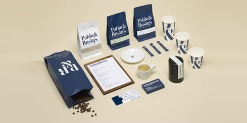
Create a unique imagery
Many brands today are becoming more creative and exquisite in terms of their imagery. Especially Millennials and Gen Z’s, the new generations do not just pick shapes, lines, or flock their designs with circles and squares. These youngsters are going beyond the literal and usual. Make sure to give your brand a unique perspective and consider your audience’s shoes. They are appreciative so don’t get worried about your efforts not being paid off.
Whatever colors, fonts, or imagery you choose for your brand’s visual identity, it pays to go beyond your personal preference. Good research, deep contemplations, and getting inputs from friends or families will help in building not just your visual identity but also your brand identity, too.