Hey there! Let’s take a break from our previous series as we tackle something a little more relevant for this month’s festivities.
The holiday season is a great opportunity for brands to showcase their creativity and personality through their packaging design. Whether you want to go for a traditional festive look or a more modern and minimalist style, there are plenty of trends and tips to inspire you. Here are some of the best packaging trends and tips for this holiday season, along with some examples of how brands have implemented them.
Trend #1: Festive, vibrant colors
Colors can make a big difference in attracting customers’ attention and conveying a certain mood or message. For the holiday season, you can choose from a variety of colors that suit your brand identity and target audience. Some popular holiday colors are green, red, blue, white, silver, and pink. You can also mix and match different colors to create contrast and harmony.
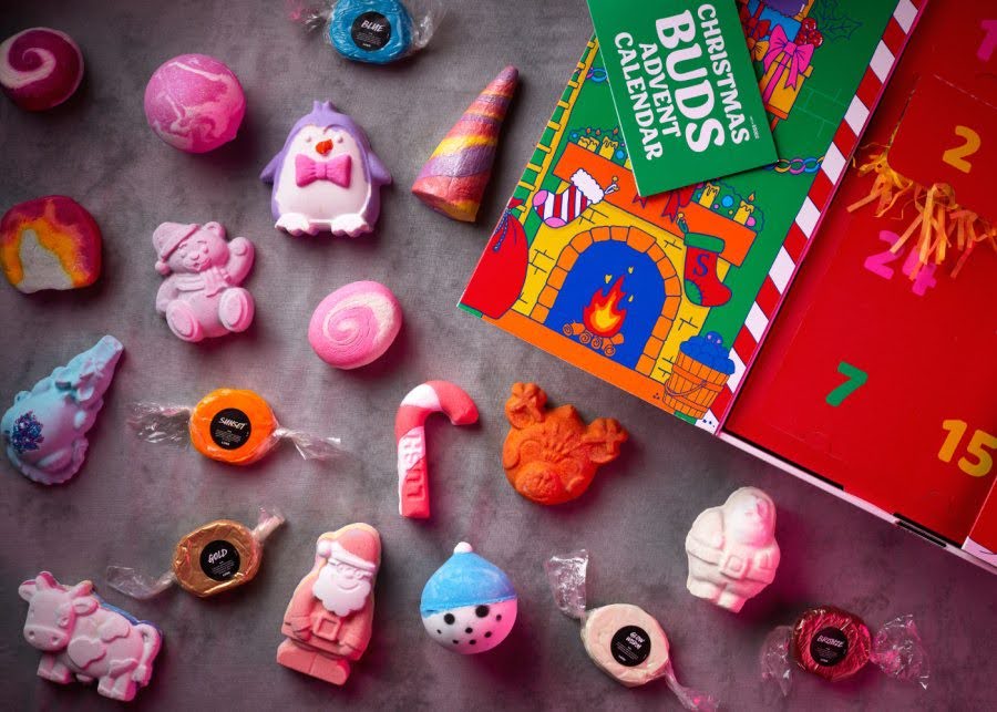
One example of a brand that uses vibrant colors for its holiday packaging is Lush Cosmetics. The brand is known for its colorful and natural products, and its packaging reflects that. For the holiday season, Lush uses bright and cheerful colors like yellow, orange, purple, and pink to create a festive and fun vibe. The packaging also features playful illustrations and slogans that match the products’ names and scents.
Trend #2: Detailed and intricate design patterns

Another way to make your packaging stand out is to use detailed and intricate design patterns that add visual interest and texture. You can experiment with different shapes, sizes, and styles of patterns, such as geometric, floral, abstract, or festive. You can also use different printing techniques and materials to enhance the look and feel of your packaging.
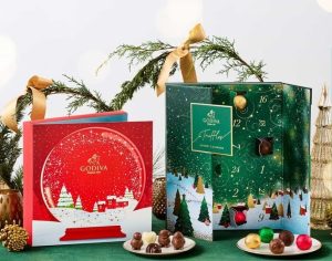
A brand that uses detailed and intricate design patterns for its holiday packaging is Godiva. The chocolate brand creates elegant and luxurious packaging that features gold foil, embossing, and die-cutting. The packaging also features intricate patterns inspired by art decor, lace, snowflakes, and stars.
Trend #3: A touch of nostalgia

Source: https://stories.starbucks.com/stories/2023/a-sneak-peek-of-starbucks-holiday-cups/
The holiday season is a time when many people feel nostalgic and sentimental about their memories and traditions. You can tap into this emotion by creating packaging that evokes a sense of nostalgia and warmth. You can use retro fonts, vintage images, classic icons, or personal stories to connect with your customers on an emotional level.
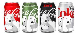
A brand that uses a touch of nostalgia for its holiday packaging is Coca-Cola. The soda brand is famous for its iconic holiday campaigns featuring Santa Claus, polar bears, and trucks. The brand uses these elements on its packaging to create a nostalgic and festive atmosphere. The packaging also features the classic red-and-white color scheme and the signature script logo.
Trend #4: Playful illustrations

Source: https://stories.starbucks.com/stories/2023/a-sneak-peek-of-starbucks-holiday-cups/
If you want to create a fun and lighthearted packaging design for the holiday season, you can use playful and festive illustrations that capture the spirit of the occasion. You can use cartoons, doodles, characters, or symbols that relate to your brand or product. You can also use humor, puns, or wordplay to make your packaging more engaging and memorable.
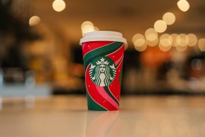
A brand that uses playful and festive illustrations for its holiday packaging is Starbucks. The coffee chain is known for its seasonal cups that feature different designs every year. For the holiday season, Starbucks uses colorful and whimsical illustrations that depict scenes of winter wonderland, cozy moments, or holiday cheer. The cups also feature the Starbucks logo as a part of the design.
Conclusion
These are some of the best packaging trends and tips for this holiday season that you can use as inspiration for your own brand. Remember to keep your packaging design consistent with your brand identity, product quality, and customer expectations. If you’re in need of a printer manufacturer for your holiday packaging, give Cr8tive Boxes and Labels a message!

